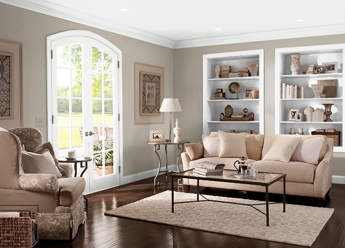
 We are a flooring store, yet we answer questions about paint every day. Paint is such an integral part of your décor, that some decision about paint is almost always involved when we are discussing flooring with customers. We have paint color samples in the store, and use them constantly with clients, as paint and floors go hand in hand. Statistics tell us that in the US, 120 million gallons of paint are sold each year. Seems like at least a million are sold right here in East Cobb! We are a flooring store, yet we answer questions about paint every day. Paint is such an integral part of your décor, that some decision about paint is almost always involved when we are discussing flooring with customers. We have paint color samples in the store, and use them constantly with clients, as paint and floors go hand in hand. Statistics tell us that in the US, 120 million gallons of paint are sold each year. Seems like at least a million are sold right here in East Cobb!
 Frequently, the customer is giving the room a total update, and changing the paint is only a part of their plan. Sometimes we help customers who have bought a home and are "making it their own", changing many things. And there are customers who are only updating the flooring. In all of these instances, the paint is a subject of discussion, whether it is the color or the type, whether it is starting from zero, or making it work with existing factors. Frequently, the customer is giving the room a total update, and changing the paint is only a part of their plan. Sometimes we help customers who have bought a home and are "making it their own", changing many things. And there are customers who are only updating the flooring. In all of these instances, the paint is a subject of discussion, whether it is the color or the type, whether it is starting from zero, or making it work with existing factors.
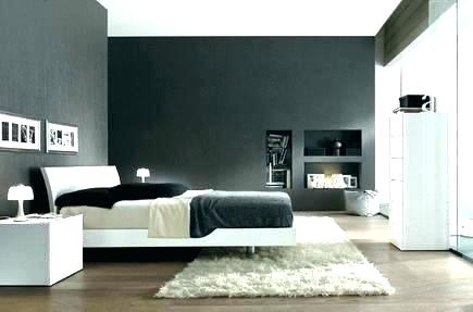
What colors are we discussing with customers? Nothing new or shocking- gray is THE color. Or we should say the colors. Gray is a color with a thousand faces. Silver gray, blue gray, green gray, light gray, dark gray, beige gray, it's safe to say that gray is a perfect neutral paint color. Gray is particularly versatile because of its wide range of undertones. A warm gray or greige (a combination of gray and beige) paint color mostly resembles a beige and can be used almost interchangeably. Cool grays can appear more modern and fresh, with soft blue and green undertones.
The beautiful secret about gray as a neutral is that you can go much darker than you may feel comfortable going with a bolder color such as blue or even beige. Gray somehow manages to stay crisp, even in the darker shades. The key is finding the right gray for your space and sampling colors thoroughly.
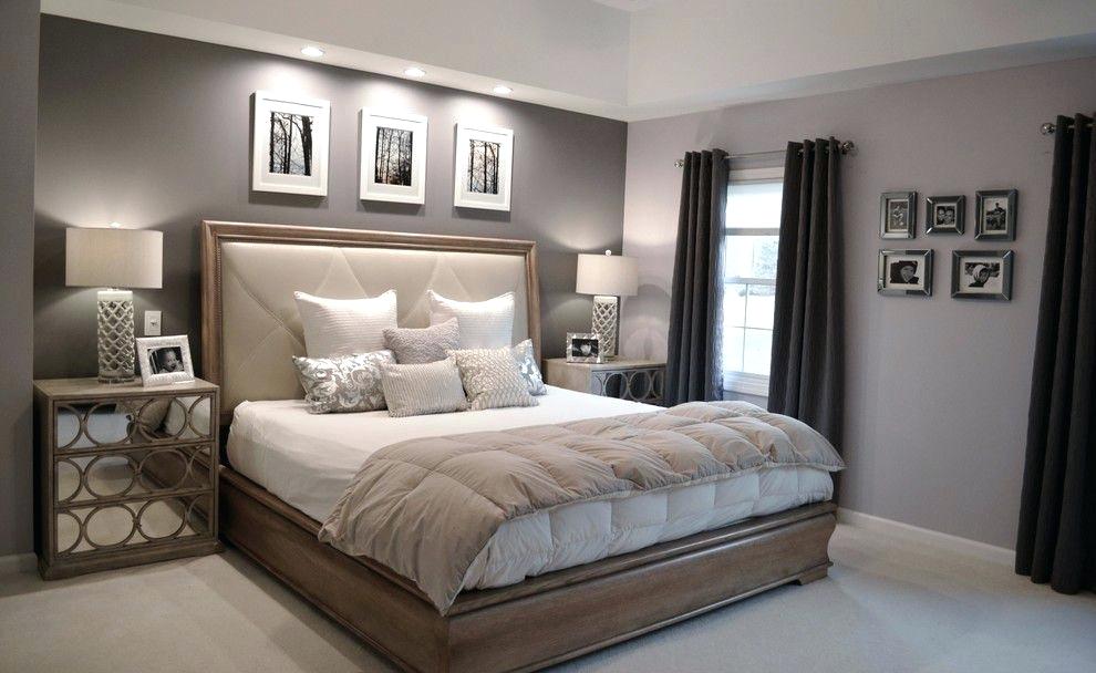 Gray is now the most popular color for paint...in fact, it has surpassed white! If you look at Sherwin William's Top 50 paint shades, the #1 shade is a gray! In fact, among the top 50 paint shades, 20 of them are gray. And, if you look at paint color fan decks, you'll see there are tons of grays. But, how do you know the right gray to use? Gray is now the most popular color for paint...in fact, it has surpassed white! If you look at Sherwin William's Top 50 paint shades, the #1 shade is a gray! In fact, among the top 50 paint shades, 20 of them are gray. And, if you look at paint color fan decks, you'll see there are tons of grays. But, how do you know the right gray to use?
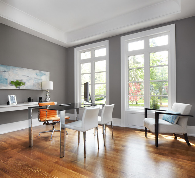 For our painting customers, we have found that 80% prefer cool tones, while only 20% prefer warm tones. Warmer tones are made with oranges, yellows and reds. They remind us of heat and the sun. They tend to make rooms cozier and more intimate. They tend to make spaces look smaller. Cooler tones include blues, grays, greens, light purples (or mixtures of that include these undertones). They are more soothing and calming. They remind us of the sky and water. Cooler tones tend to recede and hence make spaces look larger. For our painting customers, we have found that 80% prefer cool tones, while only 20% prefer warm tones. Warmer tones are made with oranges, yellows and reds. They remind us of heat and the sun. They tend to make rooms cozier and more intimate. They tend to make spaces look smaller. Cooler tones include blues, grays, greens, light purples (or mixtures of that include these undertones). They are more soothing and calming. They remind us of the sky and water. Cooler tones tend to recede and hence make spaces look larger.
 Gray is both chic and neutral. So, it's super easy to decorate with. It goes with almost everything. It's the new neutral. Years ago, it was beige, but beige has become a bit boring. Most homeowners, especially those that focus on style, opt for the trendier and more stylish gray. Gray is both chic and neutral. So, it's super easy to decorate with. It goes with almost everything. It's the new neutral. Years ago, it was beige, but beige has become a bit boring. Most homeowners, especially those that focus on style, opt for the trendier and more stylish gray.
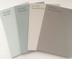
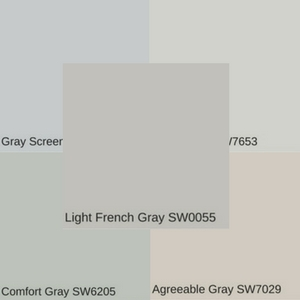
This collage shows just 5 of the variations of gray, and how they compare. Next to each other it is easier to see the various undertones.
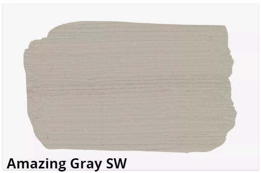 Sherwin-Williams Amazing Gray SW 7044 is a warmer gray void of any harsh yellow undertones. It has a lot of depth and works well with warm whites to create a modern, monochromatic palette. Try it in a kitchen with white cabinets and a few accents with some pops of color. Sherwin-Williams Amazing Gray SW 7044 is a warmer gray void of any harsh yellow undertones. It has a lot of depth and works well with warm whites to create a modern, monochromatic palette. Try it in a kitchen with white cabinets and a few accents with some pops of color.
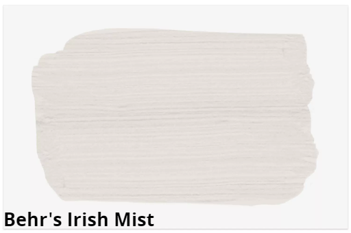
Behr's Irish Mist has an airy quality, making it the perfect paint for a darker bedroom or bathroom without a lot of natural light. There is a slight warmth to this pale gray that makes it much more versatile than a traditional beige neutral. Pairing it with crisp white trim will help lighten the color even more.
Agreeable Gray (SW 7019) is such a versatile and neutral color that it can be used as a wall color in virtually every room, including bright and low light rooms. Whether it's your living room, dining room, kitchen, family room or bedroom, it blends and complements almost all colors, making decorating a breeze. It works in bathrooms, laundry rooms, offices, and well, just about everywhere.
What's Next?
For 2020 paint colors and trends, so far, things are leaning 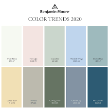 blue. Blue paint colors account for two of the first five paint colors of the year already announced. Other trending colors are soft peachy pinks and shades of green. Colors to look for all refer to nature and comfort with names like "First Light" "Light Drizzle" and "Dragonfly". The non-blue colors are softer, more muted shades---not quite pastels, but with the same relaxed appearance as some chalk paint colors. blue. Blue paint colors account for two of the first five paint colors of the year already announced. Other trending colors are soft peachy pinks and shades of green. Colors to look for all refer to nature and comfort with names like "First Light" "Light Drizzle" and "Dragonfly". The non-blue colors are softer, more muted shades---not quite pastels, but with the same relaxed appearance as some chalk paint colors.
Overall, though, all the "colors of the year" announced so far are about building a calmer, more soothing environment in your home, which indicates that creating a comfortable home that energizes and replenishes could be a major theme in the year to come.
When making decorating decisions, just keep in mind the things that are easily changeable versus the things that are more semi-permanent. While it may be an annoyance, the things that are more temporary are paint, hardware, light fixtures, area rugs, and window treatments. The things that are more fixed are a bit more work (and money) to change out, for example flooring, backsplashes, cabinetry, and countertops. So paint away for a quick refresh to your room that doesn't break your budget!
What Do I Do First?
One question we are asked by many customers: Do I paint first, or do my floors first? USUALLY the answer is paint first. If you are painting the ceiling, that is ALWAYS first. Consider if the baseboards are being replaced or not, because that will affect your painting if there is a possibility of a height change. Carpet can scuff the baseboards during installation, so we usually advise paint first, but keep a small amount of touch up paint handy.
If you are ready for new floors now and painting is a down the road project, no worries. A reputable painter will not have any problems protecting and not damaging your brand new floors. Also, by doing the painting last, you don't have to worry about touch-up painting, painting your primed shoemold, etc.
Design Tip
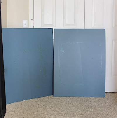 Create your own oversized paint swatches by painting two coats of the color(s) you are considering on a large piece of poster board. When dry, use double-stick tape to adhere to the wall. Move the poster board around the room(s) as needed, and be sure you are using the sheen you are considering. Look at the color under various lighting conditions, daytime, at night, cloudy day, etc. If one color does not look absolutely perfect in every room, go with the color that looks best in the room or at the time of day that is most important to you visually. Create your own oversized paint swatches by painting two coats of the color(s) you are considering on a large piece of poster board. When dry, use double-stick tape to adhere to the wall. Move the poster board around the room(s) as needed, and be sure you are using the sheen you are considering. Look at the color under various lighting conditions, daytime, at night, cloudy day, etc. If one color does not look absolutely perfect in every room, go with the color that looks best in the room or at the time of day that is most important to you visually.
I Was Floored By Enhance
Amy in Woodstock writes:
"Enhance Floors & More did a really good job. They're very friendly, helpful and knowledgeable. We had our living room carpet replaced by one of the Big Box stores not that long ago. It was not worn out, but we were having issues with it and needed to replace it again. When the owner came out to measure for the new carpet, he explained to us why it was doing that and what we should choose differently so moving forward we wouldn't have any more problems. He helped us choose the right carpet for what we needed. I appreciated him sharing that knowledge with us. The installers were very professional, polite and nice. In addition to the living room they replaced all of the carpet upstairs. It took 2 days to complete the work. They moved all of the furniture and were careful to put it back in the correct place, even asking before they left if everything was where it should be."
Thank you, Amy. We are always here to help and share the knowledge we have gained from 34 years of selling and installing new floor coverings. We know this carpet will perform much better for you than the previous carpet did.
|